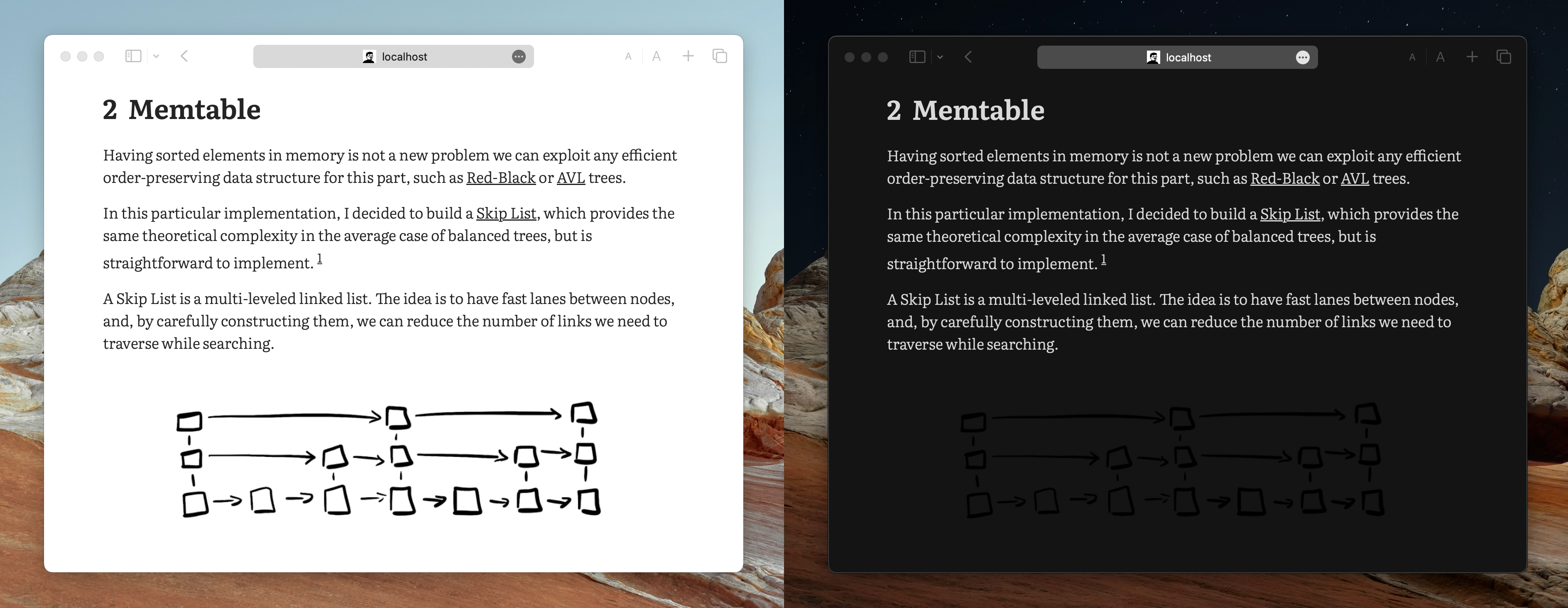
The Problem #
During the writing of my first blog post, I found a problem with images. The drawings I made are png with a transparent background, and, since the lines are black, they look horrible on dark mode, as you can see below.

I wanted a quick way to define light and dark mode images for Hugo. Also, controlling image size easily would be great too.
Solution #
GitHub lets users specify in which theme they want readme images with two tags:


I decided to do something similar, defining several tags, #dark, #light, #small, #full, which controls on which theme an image appears, as well as sizing.


What’s left is to tweak the hugo image render function to accomplish this.
Code #
Hugo renders images with the logic defined in:
/layouts/_default/_markup/render-image.html
We can override it and decide which class to apply to an image based on image tags. The below code first extracts the tags form the url, if any, and then applies classes to the figure based on them.
{{/* Split URL at # */}}
{{ $url := .Destination | safeURL }}
{{ $file_name_array := split $url "#" }}

{{/*
Iterate over all tags, which are in pos 1 to len array - 1,
and build the img class string as "img-tag1 img-tag2 ..."
*/}}

{{ $classes := "" }}

{{ range $idx := seq (sub (len $file_name_array) 1) }}
{{ $tag := index $file_name_array $idx }}
{{ $classes = printf "%s img-%s" $classes $tag}}
{{ end }}

{{/* Use the computed classes on the rendered figure */}}
<figure class="{{ $classes }}">
    <div>
        <img loading="lazy" alt="{{ .Text }}" src=" {{ $url }}">
    </div>
</figure>
Finally, we need to define image classes in our CSS as follows:
.dark .img-light {
  display: none !important;
}

.light .img-dark {
  display: none !important;
}

.img-small div {
  display: flex;
  align-items: center;
  justify-content: center;
}

.img-small img {
  scale: 80%;
}

.img-full div {
  display: flex;
  align-items: center;
  justify-content: center;
}

.img-full img {
  width: 100vw !important;
  max-width: 100vw !important;
}
Where dark and light classes define color schemes and are added dynamically to the body.
Result #
Below you can see the result of the following block, switch your system theme to see both images.


This solution is currently implemented in the Typo theme, which is in use on this website, go have a look!
I hope this was useful, thank you for reading!